
Trend analysis of Covid-19 infection and death rates in Bangladesh
Shamsul Alam and Mohammad Zariab Hossain | Tuesday, 1 September 2020
Now it is important to understand the trend of Covid-19 pandemic infestation and death rates in Bangladesh while we are gradually relaxing all economic activities and trying to bring back the normalcy in livelihoods. It is imperative to understand the trends of infestation and deaths to adopt strategies for appropriate health measures and Covid containment. In doing so, we have used daily data on Covid infestation and death rates released by DG Health Services as official sources of data. Though Covid infestation has first broken in March, we have organised daily data from April 3 released by the DGHS. Graphically and econometrically we have exhibited and analysed growth rates of Covid infestation per cent on tested cases and per cent of death rate on infected numbers by months and for the whole sample period of April 3 to August 28, 2020. We used per cent figures of Covid infestation as the absolute infection number is highly correlated to tests conducted. Per cent of death rate is, likewise, used instead of a total number of deaths. Below we first present graphical depiction followed by econometric analyses of infestation and death trends monthly and for the whole period. Daily observations of five months form a large sample size to have a reliable trend estimates. Econometric tools used have also been explained before the presentation of estimates following simplicity in an explosion.
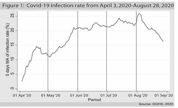
Both Covid 19 infection spread and the death rate is the most concerning issue in the Covid fall out in the national life. The graph (figure-1) shows the five days moving average (MA) as to smoothen daily fluctuations of the infection rate from April 3, 2020, to August 28, 2020. It can be easily seen that the infection rate was rising at a sharp rate during April and May. The rate of increase decreased a bit in June and July; however, the infection rate kept increasing during this period. From the graph, we can see that the infection rate reached a peak at the beginning of August, and it began to slow down and keeps decreasing until the end of our data period.
We calculated the growth rate using least squares regression for each of the months. The model is as follows,

Here the dependent variable is the natural log of daily infection rate in per cent of tested cases, and the only independent variable is time, which is daily observation. We estimated the regression coefficient for the above model for the whole period and each of the months to discern the average daily growth rate of the infection rate for the sample period. The following table represents the average daily growth rate of the infection rate.
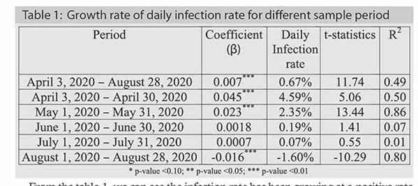
From the table-1, we can see the infection rate has been growing at a positive rate from April to July. The sharpest increase was observed in April (4.59 per cent) and May (2.35 per cent) as evidenced by the graph where we can see the rate of increase was sharp in those two months, April has been the severest month, though. The growth rate slowed down in July and started showing a negative growth rate in August, which is statistically significant. The infection rate has been started falling since May and gradually slowed down from June, and infection growth trend has been negative (flattening) from August. Many suspected that from the onwards second week of August, there might have resuscitation of infection. It is due to the possible second wave originated by intense mobility of people from urban areas to rural areas involving a couple of end days of July beginning of a couple of days of August (1 August was the Eid ul Adha day). At least August graph (onwards second week) does not depict such a trend of the resurgence of so-called 'second wave'.
On the other hand, the death rate due to Covid is entirely different from the infection rate. The first month started with a very high death rate which later began to fall within a week.
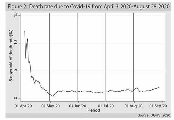
However, from the analytical viewpoint, we can explain this abnormality in the first month. If we closely observe the data, we can see initially at the beginning of April the lab test was done in a small number resulting in a low rate of infection which drove the death rate higher. As the lab test number was increased, the actual death rate figure came down to a range between 1.0 per cent and 1.5 per cent. The death rate remained almost stable, and although it slowly went down after mid-June, we can observe a little uprise after mid-July. In August, the death rate surprisingly shows a slightly increasing trend. We have seen in the first figure that the infection rate is going down in August. Hence, raising the death rate during the same period could mean the infection is becoming fatal. It indicates that the people who have been diagnosed with Covid 19 positive previously are more prone to death.
Like infection rate, we also calculated the average monthly growth rate of death rate as well as the whole of the sample period. In this case, the dependent variable is the natural log of daily death rate, and the model is:

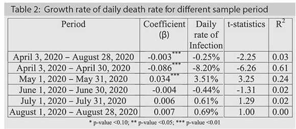
During the whole sample, we observe an average daily negative growth rate in the death rate from Covid-19 pandemic. Across the entire sample period, Covid-19 death rate has decreased significantly. As depicted in the figure-2, the negative growth rate in the daily death rate of April can be confirmed from the regression result. In May, the death rate was showing a positive growth rate that was statistically significant, i.e. month of May has shown significant positive growth in death rate. In June, the death rate was declining; however, it climbed up by a minimal margin in the last two months but statistically not significant. Virtually, from June death rate remained to flatten meaning not getting worsen.
The following tables show Pearson's correlation among different variables related to the Covid-19.
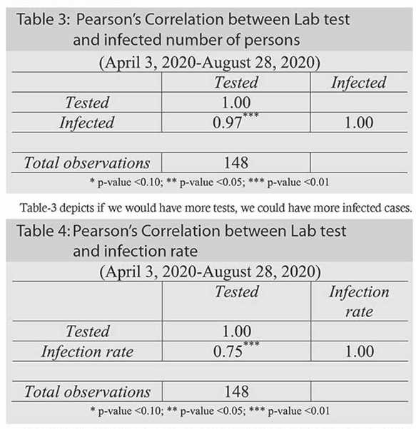
Table-3 depicts if we would have more tests, we could have more infected cases.
The number of laboratory tests and the infection rate is also positively and significantly correlated, meaning more Lab tests could result in more infection rate. This could bring the infected persons with asymptotic or subdued symptoms of Covid infected persons if random testing was allowed other than testing only cases with Covid apparent symptoms. For effective and quicker Covid containment, this could have been an appropriate strategy.
30 DAY'S FORECASTING OF INFECTION RATE AND DEATH RATE USING ARIMA METHOD: Before doing ARIMA modelling, we need to check the stationarity/unit-root of infection/death rate using Augmented Dicky-Fuller (ADF) test. If we find unit root in the series, we can conclude there is non-stationarity in the series. In this case, we need to take difference series as level series will produce spurious regression.
After checking the unit-root in the data, we need to check the autocorrelation and partial autocorrelation function. It is to see which ARIMA model best fits our data.
Then we can check several specifications of ARIMA models to check few diagnostics such as standard error of the model, the significance of coefficients, AIC and SBC criteria. Finally, we can decide which ARIMA model is best for our purpose. Here, the most important thing is the parsimonious model which has fewer parameters; otherwise, we lose degrees of freedom. Moreover, more parameters may lead to over-fitting of the model. Therefore, we will select the most parsimonious model based on Box-Jenkins Methodology.
After performing the best ARIMA specifications, we will forecast the series for the next 30 days with the upper and lower bound of standard errors.
INFECTION RATE: If we look at the infection rate data, we can see that infection rate quickly climbed up to a level around 20.0 per cent by the end of May and has remained around that mark with little movement till the end of our data period. Using the ADF (Augmented Dicky- Fuller) test, we can see that the ADF test statistic is -3.10 which is bigger than the critical value of -2.353 (in absolute term) at 1% significance level. This indicates the series is stationary and we do not need to differentiate the original series using first difference or subsequent differencing.
Since there is no need for differencing, the model will be called ARMA (Auto Regressive Moving Average) instead of ARIMA (Auto Regressive Integrated Moving Average). We can now see the autocorrelation and partial autocorrelation function to identify the specifications of the ARMA model. After checking several specifications, we found the following values related to each of the specifications.
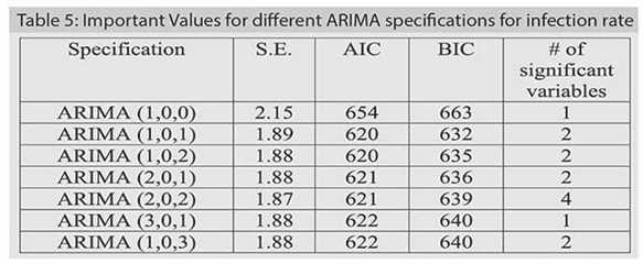
From the table-5, it can be seen that ARIMA (1, 0, 1) is comparatively suitable as it has small standard deviation like other efficient model, lower AIC and BIC value and more importantly it is parsimonious with only two parameters and both of them are statistically significant.
Now let's do the forecasting of Covid-19 infection rate using ARIMA(1,0,1) or ARMA(1,1) model from 29 August, 2020 to 27 September, 2020.
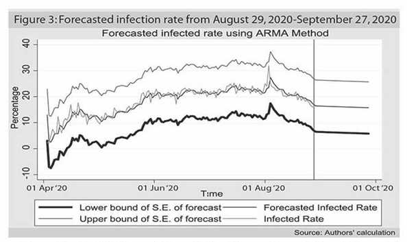
The red line (middle line, not the vertical red line which marks the starting point of the forecasting period) is the forecasted value of Covid19 infection rate. If we compare with the yellow (above) line which represents the actual data till 28 August, 2020 we can easily understand that the model performs very well as the in-sample forecast is very close to the real data. The 30 day's forecast from 29 August, 2020 to 27 September, 2020 is showing slight downward trend which is also in line with the daily growth rate of Covid 19 infection rate for August, 2020 that is -1.60 per cent (falling infection rate). The blue and green lines are the upper and lower bound of the standard errors of the forecast, which tell us that our forecasting lies within 95.0 per cent confidence interval. What we can forecast then:
Death rate: Using the ADF test, we can see that the ADF test statistic is -11.77, which is higher than the critical value of -2.353 (in absolute term) at 1.0 per cent significance level. This indicates the series is stationary and we do not need to differentiate the original series using first difference or subsequent differencing.
Since there is no need for differencing, the model will be called ARMA instead of ARIMA. We can now see the autocorrelation and partial autocorrelation function to identify the specifications of the ARMA model. The autocorrelation function and the partial autocorrelation function shows similar kind of pattern and cuts at first few lags. It is an indication of an ARMA model. Now let's check several specifications.
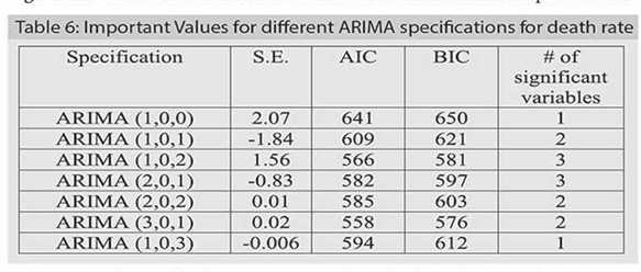
From the above table, it can be seen that ARIMA (1, 0, 1), ARIMA (1,0,2), and ARIMA (2,0,1) are more suitable specifications than others. Even though ARIMA(1,0,1) model is the parsimonious model having lesser number of parameters to estimate, ARIMA (1,0,2) and ARIMA (2,0,1) models outperform ARIMA (1,0,1) in terms of standard error and the AIC and BIC criteria in the case of the death rate. Following this result, we have forecasted death rate using both ARIMA (1,0,2) and ARIMA (2,0,1) models and have found that ARIMA (2,0,1) has a better result. In table 6, we can see that ARIMA (2,0,1) has super low variance than ARIMA (1,0,2) and the information criteria are very close to the ARIMA (1,0,2) model.
Now let's do the forecasting of the death rate due to Covid 19 using ARIMA(2,0,1) or ARMA(2,1) model from 29 August, 2020 to 27 September, 2020.
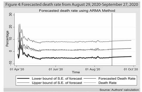
The red (middle) line is the forecasted value of Covid-19 infection rate. If we compare with the yellow (above) line which represents the actual data till 28 August, 2020 we can easily understand that the model performs moderately well as the in-sample forecast is close to the real data. The 30 day's forecast from 29 August, 2020 to 27 September, 2020 is showing a slight upward trend. The interpretation can be that despite the infection rate is lowering down, the number of the death toll from the previous infection is still stagnant which are pushing the death rate (which is the ratio of a number of dead people to the infected ones) slightly upward.
GROWTH RATE OF INFECTION AND DEATH RATE IN THE FORECASTED PERIOD: We also calculated the daily average growth rate during 29 August 2020 to 27 September 2020 to see how the growth rates move in the next month i.e., in September 2020.
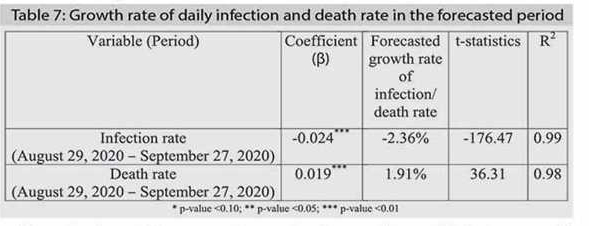
From the above table, we can observe that the growth rate of infection rate will go down, and the death rate is expected to rise in September. Since the prediction is linear, the R2 is showing very high value and also the t-statistics; so caution is required in interpreting the results. However, in a generalised way, we can corroborate that the infection rate may go down, and the death toll is likely to rise in the coming month. These are, however, subject to factors like that the current Covid-19 situation is not affected by any other external factors or any breakthrough in Covid-19 medication or prevention. Virologists can better explain whether, by mutation, any fatal strain of Covid-19 has developed. The fear of 'second wave' of Covid infestation due to the big movement of people during Eid ul Adha has not had any push on the increase in Covid infestation.
Dr. Shamsul Alam is an Economist and Mohammad Zariab Hossain works as Research Assistant to Shamsul Alam. sambau23@gmail.com